Conversation
|
Notifying subscribers in CODENOTIFY files for diff 44d4f0f...0dab357.
|
 katjuell
left a comment
katjuell
left a comment
katjuell
left a comment
There was a problem hiding this comment.
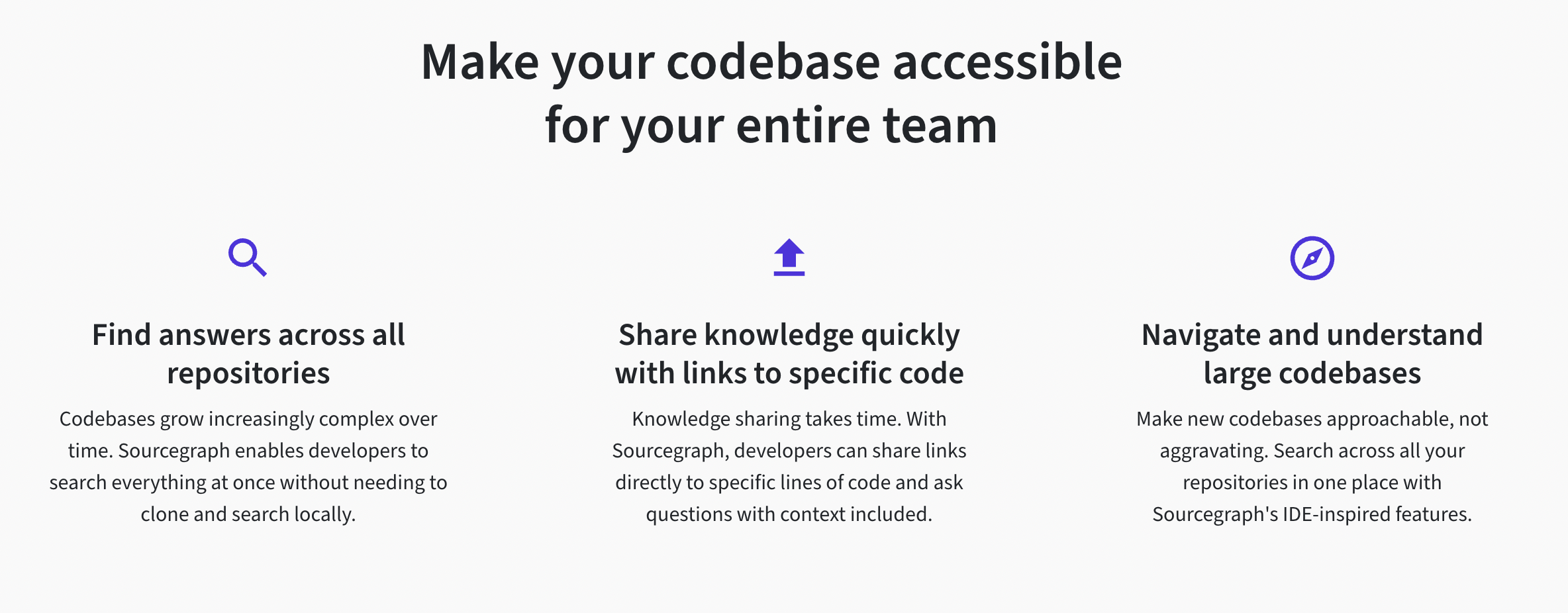
Looking good! A few things that I'm noticing:
- We'll need a link to this page from the use cases index page.
- We've got some content jumping in the carousels on mobile. If we set a default height in the following places, we should be good (I've added the default here as
h-<number>):
On CustomCarousel:

On Quote Carousel:

| </div> | ||
| <div className="d-flex flex-column flex-lg-row mt-lg-4 mt-6 mb-6"> | ||
| <div className="text-center mb-4"> | ||
| <CrosshairsGpsIcon className="mb-4 text-blurple" size={40} /> |
There was a problem hiding this comment.
Logos need to have the correct color to match the Figma
There was a problem hiding this comment.
I noticed that, after #5258 was merged, the color of the icons on the other Use Case pages changed to blurple. It seems important that they are uniform, because they otherwise use the same template. Should we also change the color of the icons on the other two pages?
There was a problem hiding this comment.
Good callout @zlonko — @bretthayes what do you think? Happy to go with whatever makes the most sense and leads to uniformity. Just think we should flag the color change in the PR message for stakeholders, if we are keeping it (it looks like link and button color changes were flagged as having changed, but not icons)
There was a problem hiding this comment.
@katjuell @zlonko I think we should stick to the design consistency and keep the icons blurple. I made the decision to change all links/CTA's, icons, button bg's, and complimenting elements alike to use blurple given that the homepage design sprouted this. Part of this also follows our Brand Guidelines for blurple.
I think that makes the most sense to create a uniform design throughout the site. But I agree, we should just mention it in the PR description in case stakeholders want us to revert part or all of these changes in a separate PR or have icons be a different colour per page design. I could see some potential colour theory conflicts but I digress lol.
There was a problem hiding this comment.
Thank you for these insights, @katjuell and @bretthayes. I will make sure the icons are included in the PR description for stakeholder review.
| services, and fix the issue everywhere in your codebase so it won't reoccur. | ||
| </div> | ||
| <div className="d-flex flex-column flex-lg-row pt-1"> | ||
| <Link |
There was a problem hiding this comment.
Can we add button tracking on these CTAs? I notice the other use case pages need them here as well — I can create a separate follow up issue and deal with it — don't worry about that here. Let's just make sure all the CTAs on this page have the correct tracking attributes
There was a problem hiding this comment.
Great point to include. I added tracking to the following CTA buttons in 3746a6c:
- Hero: Request a demo
- Hero: Try Sourcegraph now
- Body/"Get started with Sourcegraph": Request a demo
- Body/"Respond to incidents faster": Ready to get started?
Are there any others on this page that are appropriate to add tracking to? On other Use Cases, it doesn't look like we are tracking links to "Learn more", so I am a bit unsure what is in scope.
I am happy to support the follow up issue, as well.
|
Thank you, @katjuell! Responding to your initial comments:
|
|
@zlonko added commits here to address the funkiness that I still saw on carousels on smaller screens. We should be good to go now, but take another look at this page, the other use cases pages, and the code insights page to sanity check. I also went ahead and added the tracking attributes to the other use cases pages. |
|
@katjuell Thank you for updating the carousels and adding tracking to the other pages. The Use Case pages and the Code Insights page look good. One note, it seems that the with
without
|


|
@zlonko feel free to push a fix! |
|
@zlonko I try to look at Galaxy Fold defaults for x-small! This looks good to share with stakeholders cc @elzannewentzel |
 zlonko
added
the
marketing-request
zlonko
added
the
marketing-request
|
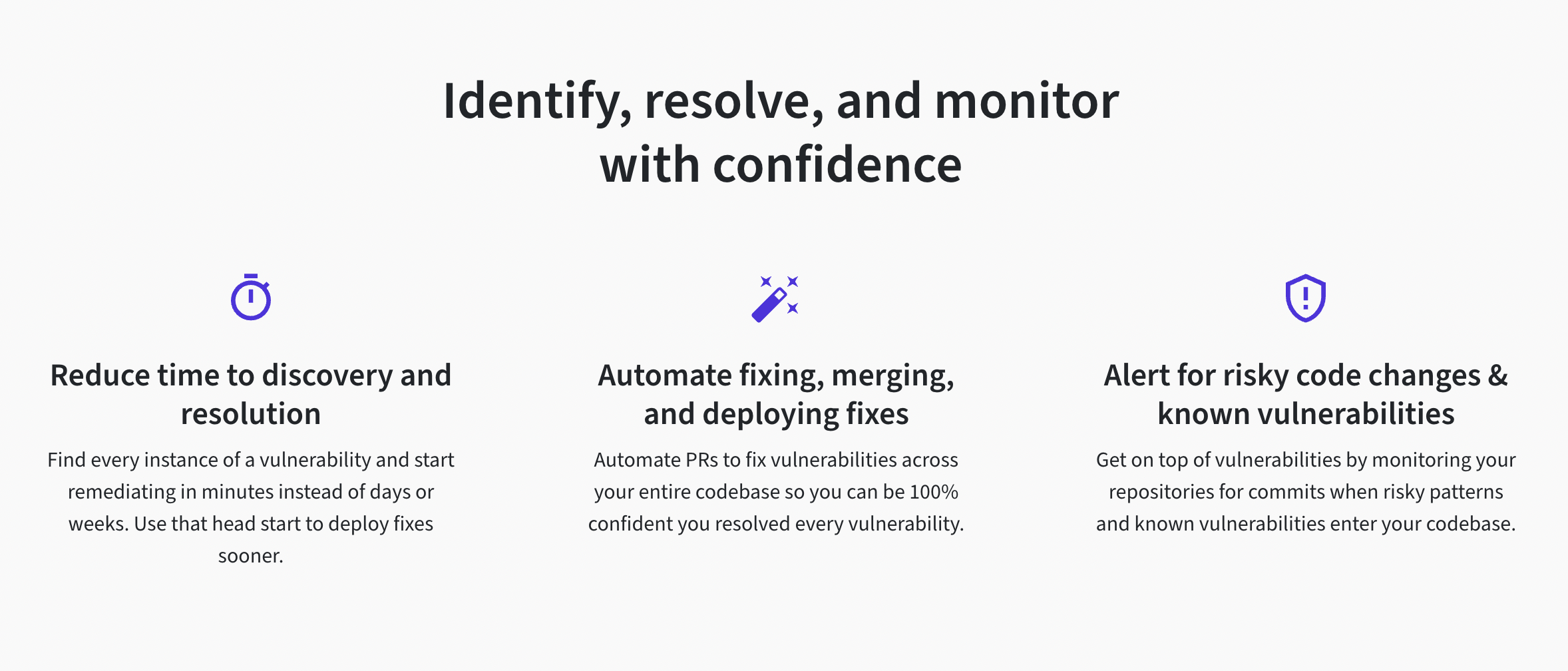
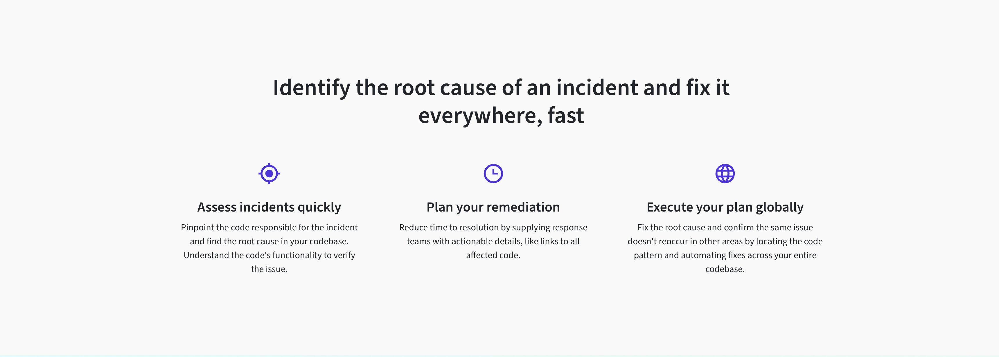
@elzannewentzel That's great! As requested, I edited the copy and gave the "Plan your remediation" column a little more room on desktop. Visual balance is a little tricky there because there is less text in that column than in the other two.
|
|
Thank you @zlonko ! I'll send it for final review. |
|
Just noting here to double check any logos in this PR that were updated in #5276 |
|
@zlonko Approved to deploy 👍 Thank you ! |
|
@katjuell Could you provide a final pass for approval? |

6 participants
This closes #5237 by creating the Use Case page for Incident Response.
Design and copy originate from Figma. The metadata comes from the provided file.
Notes
aboutwere updated with Colour and Gradient Improvements #5258. This updated link, icon, and button colors from blue toblurple.Testing
/use-cases/incident-response